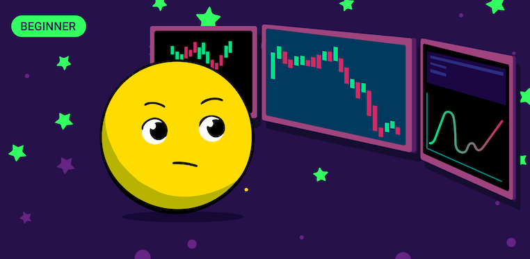
Successful trading depends on the user's ability to predict the rise or fall of quotes. To do this, different methods of market analysis are used. The first thing that is necessary to build an effective strategy is to read the charts of cryptocurrencies correctly, that is, to see signs of a continuation or reversal of the trend. This skill is called basic because with its help you can quickly analyze the situation in the market.
An experienced trader can predict market behavior with a high degree of probability based on the readings of the price chart. It is the right way to determine what awaits the cryptocurrency in the future, whether it should be invested in it or it is better to sell now. But what are the types of graphs, and how do read them correctly? Let's try to figure it out in this article.
Types of Stock Charts
There are several types of stock charts.
Candle Chart
This is a very convenient tool that transmits information about price dynamics over a certain time. At the same time, the opening and closing prices represent the body of the candle, and the price of the maximum and minimum form its shadow.
Similarly to linear cryptography, each mark corresponds to a certain time interval. But at the same time, not only the price is shown, but also its highs and lows for the designated interval. If at the end of the segment, the asset rate has decreased in comparison with the initial one, the candle is painted in black or red. In case of an increase in quotations, the column turns white or green.
To learn how to read candlesticks you need to know that there are 2 parts in a Japanese candle:
- Body. Displays the difference between the asset price at the beginning and end of the range.
- Shadow. Shows which maximum and minimum marks the quotes reached during the corresponding interval.
Linear Stock Chart
This is the simplest and most understandable type of stock chart in analysis. Such a graph is a polyline, and each segment reflects the results of trading for a certain unit of time (for example, for 1 minute or 1 hour). Each point is the price at the end of the selected time. Line charts are very convenient when you need to view a large number of indicators at the same time. With such a schedule, it is easier to perceive information.
Bar Chart
European modification of Japanese candlesticks. Instead of shadows, horizontal dashes are used in this type of diagram. The body of the bar is painted green or red, depending on the growth or fall of the quotes. Horizontal lines inside it indicate the value of the asset at the time of the beginning and end of the time range.
The main difference from a linear chart is that each bar contains detailed information on price dynamics for a certain time. The left line of the bar is the price of the asset at the time of the opening of trading. The right one is the price at the close of trading. Vertical – the spread of prices from the minimum to the maximum for the selected period.
Cluster Graph
The cluster graph contains parameters that are useful for analysis. This type of chart is mainly used by experienced traders, as it needs to be analyzed correctly
How to Read the Charts on Cryptocurrency Exchanges?
To be able to analyze and predict the market situation, first of all, you need to learn how to read cryptocurrency charts. Most of the charts contain the main values, which are used to determine the potential for the fall or growth of the cryptocurrency. Charts most often include:
- Numerical indicators. Any asset is sold at a certain price at a specific time. Prices in a particular period are extremely important for determining the trading models of a product. There are 4 price points in total: minimum, maximum, closing, and opening. As it is easy to guess, the maximum is the minimum price of a coin, and the minimum is its minimum cost. Closing is the closing price of trades, and the opening is the price of their opening.
- Ticker. This is the official name of the asset, which is indicated in parentheses. For example, the ticker symbol of Bitcoin is BTC. Tickers need to be known since prices are mostly indicated near such asset names.
- Turnover volume. This is the total amount of cryptocurrency that has been sold for the entire time or the time chosen by the trader.
- Trend lines. This tool is used to determine commodity activity shortly. A trend line is a straight line connecting two price points on the chart. At the same time, the important point is to choose the correct distance between the points. If they are located too close, then the data obtained will not be enough to form a correlation. If the points are located too far away, then the analysis may be incorrect.
- Support line. This is an imaginary line that a trader draws for himself to understand below what value the asset price will not fall. This tool is useful in case of market instability to understand what level the price may fall.
- The line of resistance. This is an imaginary line that a trader draws for himself to understand the maximum possible price of a cryptocurrency before the market starts being afraid to buy an asset. However, it should be understood that the breakthrough of an asset beyond the resistance line (as well as beyond the support line) is not a unique phenomenon, and this can happen.

